MoarDammit 3.0.0
MoarDammit turned 8 this year in August and I thought it might be about time that I migrate and rewrite the backend for …
It rises! Now with even more video errors than before! It’s been a long time coming and now Ruffle has enough features to support what seems like a viable amount of the catalog. MoarDammit is officially over 9 years old this year! It has been my rewritable side project all these years, and I’m glad to finally give it one more necessary push to keep it alive.
Yes, absolutely. Adobe Flash is 100% dead and it was sad seeing MoarDammit go from working to “plugin not supported” overnight. Well, I had ample warning but MoarDammit isn’t a site that is made from flash, it’s a site which displays many types of content. It just so happens to be mostly flash content at this point. However I was not idle in the background. I’ve been trying to discover many ways to bring this site back to life and I believe there are a few ways I’m going to be able to bring it back to 100% parity to pre-2021. More on that in later posts. For now the most promising solution to getting native support for dynamic content has been Ruffle. If I could even reverse the flash API it would be the my project of choice to contribute to. Unfortunately my rust skills are subpar and I can’t reverse Adobe’s protocols with the amount of time I’m spending on D20Kit and professional career.
So let’s start with the groundwork. MoarDammit was originally a single php page that hard linked videos to ids and vanities, it evolved quickly to include a database and moving to being one of the first ‘single page app’ video platforms in existence. I have no practical proof as I don’t have a time machine but MoarDammit was technically a SPA before even YouTube was. MoarDammit has been the ground where I either rewrite with experience or greenfield development using an experimental framework for evaluation. This time around it was the experienced path as I chose to continue using NestJS for the backend and migrate the legacy AngularJS application to the fancy new Angular 12 app. It wasn’t terribly difficult actually and I still have yet to run into a use case for Angular where the framework itself didn’t do something I wanted or need it to do. It’s amazingly opinionated in a way that I believe makes proper sense in the JS ecosystem.
Rather than installing another pegleg onto MoarDammit I decided it’s about time it get a facelift into the future using web technologies developed within the past decade. After the successful migration to NestJS it was about time the frontend get some similar love and be upgraded to be using Angular. While not completely necessary the old UI was actually getting in the way of multiple attempts to modernize and leverage usage of the new Ruffle library I mentioned in previous posts. While there are a lot of blank pages now from potential bugs or ActionScript3 swfs it should only get better from hereon out. The most prominent issues I’ve come across are slow motion videos and out of sync audio. However it seems some work as well as the day it was uploaded.
With much practice using Angular it was quick and easy to bootstrap the new version but the more difficult task was to actually make it look halfway decent. After noticing the large increase in YouTube competitors over the years they all brought their own flavor of bad UI choices trying to imitate it. One thing YouTube does well it present the video content edge-to-edge and at the proper aspect ratio for the video. It’s a clever way to take advantage of the dynamic shape. Meanwhile MoarDammit presents the content corner-to-corner, the entire screen is the video content and depending on the aspect ratio gives huge letterboxing. I haven’t found another site quite like MoarDammit besides stumbleupon and even that website suffered a lot in recent years.
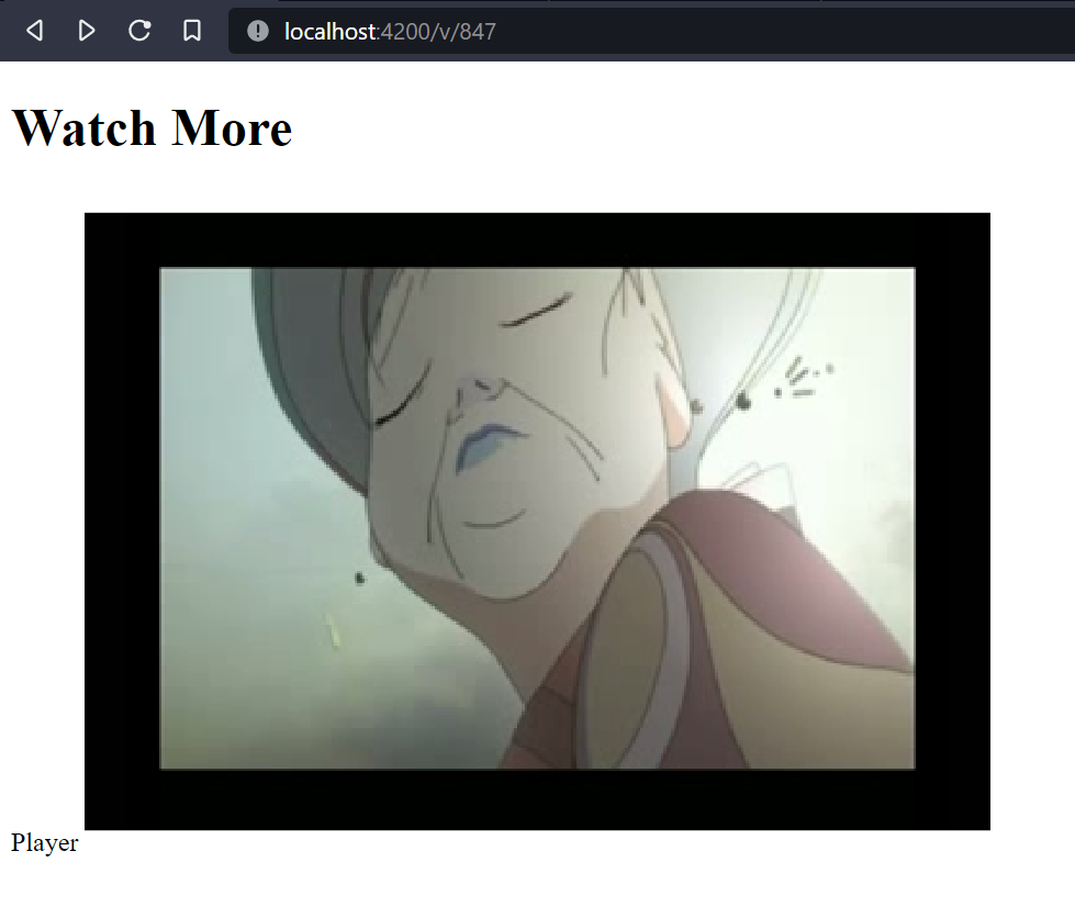
Ruffle has been surprisingly easy to integrate, even with Angular. It’s neatly contained and the only critical errors that occur are when a swf truly explodes to using 100% CPU. It’s impossible to know which ones are going to work but from the page it seems if the swf uses ActionScript2 it has a large amount of support. Over the past few months of 2021 I’ve been sampling Ruffle nightly for compatibility with a fair amount of swfs. Early September a ratio was hit that I’m comfortable with so work began on rewriting the frontend. Not that long ago the new version looked like this.

MoarDammit v4.0.0-alpha
Still a ways to go before we even get close to something that looks like v2 or v3.

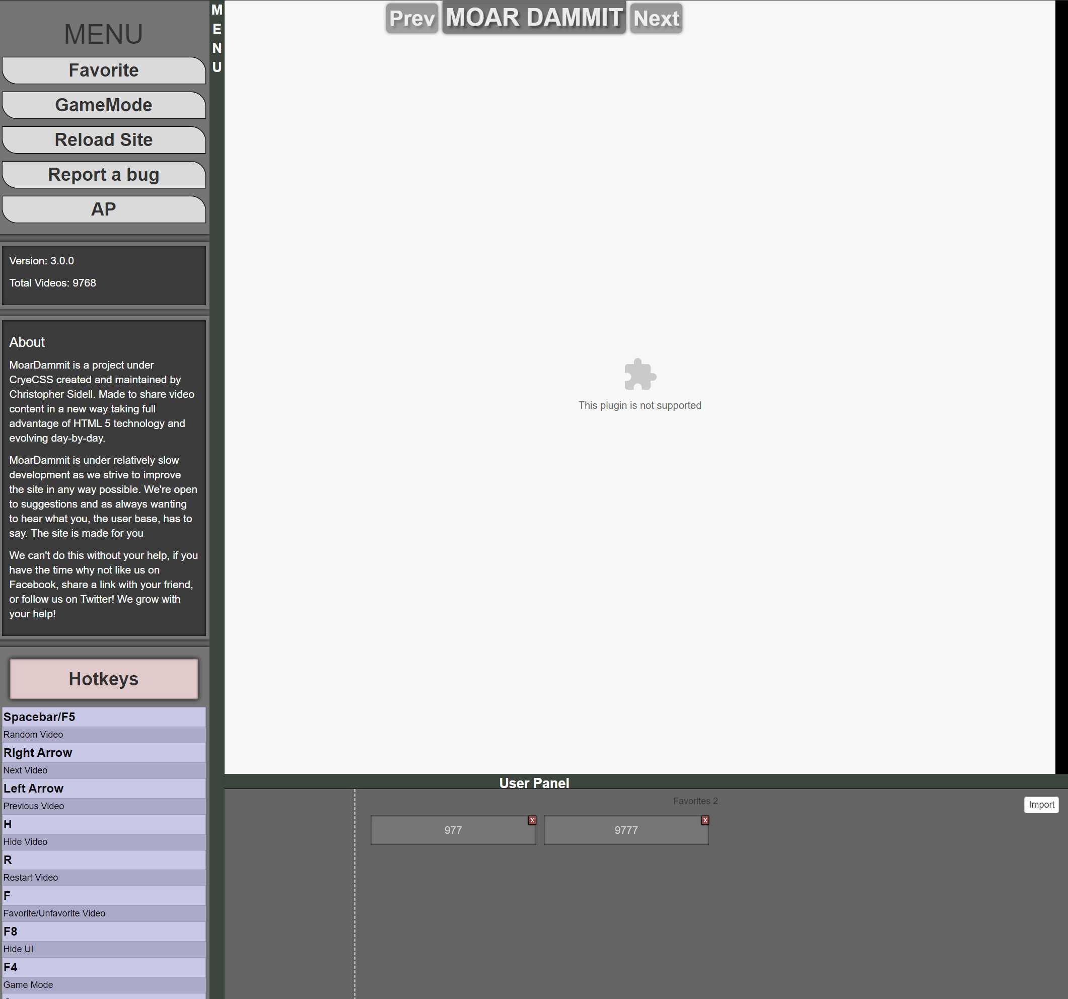
MoarDammit v3.0.0
The first things that caught my eye is that I truly never did put anything in the left column of the user menu. I believe the original intention was to include something along the lines of a user profile or comment section. That or the comments would have been hidden in a right menu. Regardless I didn’t want to put up the effort to create the whole cascading menu system again because it never quite felt right. It was cool, but didn’t make for a great experience. For those who have followed the site for years might even remember the mechanical “swish” sound the panels originally made. That fortunately was killed off.

MoarDammit v3.0.0 user menu
For the new system I wanted to take advantage of the new logos that were created. They look great and mesh well with the theme I’m hoping to go for in time. We’ll see what else comes up in the idea farm but what I noticed from the start is MoarDammit has a nice narrow vertical column that would perfectly fit in the user panel. It still had too much to include it all, but that never stops me! The primary functions of the site still work, the hotkeys did lose a few. H no longer stops the video and instead takes the functionality the A key had with audio mode. R, no longer reloads the video in the page because Ruffle doesn’t play too well with that. C which never actually had any functional component associated with it has been removed from the menu. Game mode still exists and works, but I’m not sure if there are many games that will work or work well.

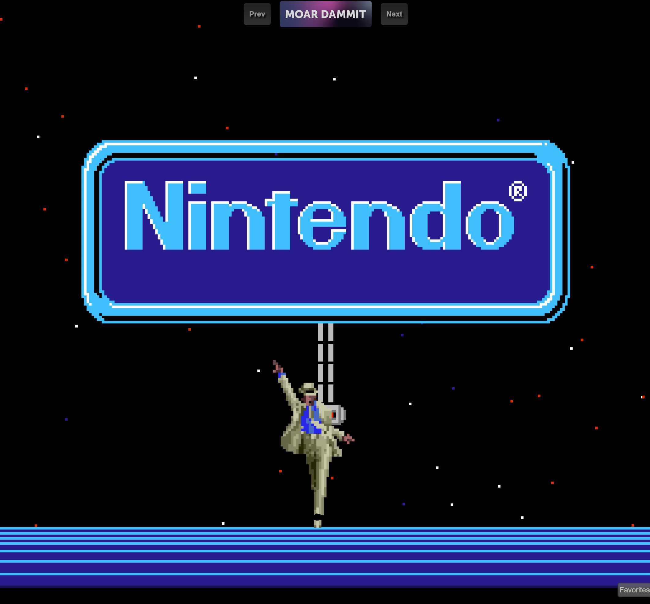
MoarDammit v4.0.0
The first thing I really wanted to do was remove a lot of the visual clutter because I didn’t want to spend a lot of time trying to build a consistent visual system that hides itself like the previous one did. Not that it would be overly difficult, but I wanted something out in September not October to December. The new logo really pops and draws your eye to where the fun really is.

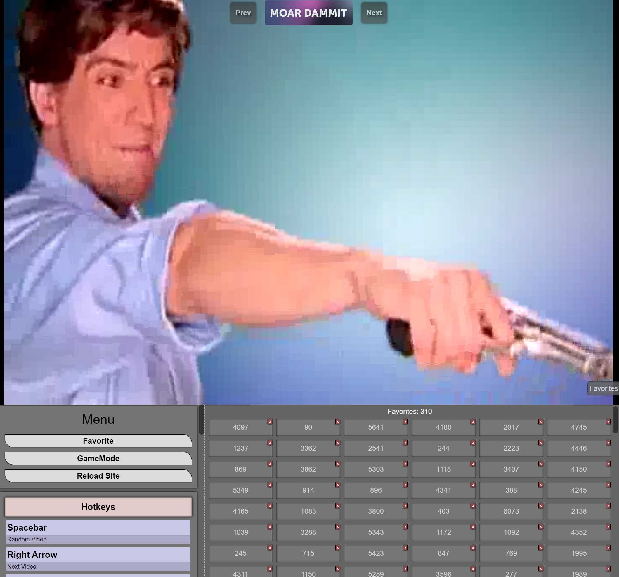
MoarDammit v4.0.0 favorite menu
The menu fits so snugly right where that empty space once was, now that’s what I call prime real estate. Screen sizes have also changed since MoarDammit originally was built. No longer is 720 the max resolution of the rich kid on the block. 4K is here to stay and who knows where 8K and above will be. I imagine UI scaling will keep higher resolution monitors in check. However the favorites list has had some amount of love when it comes to this. It now has 3 steps, one which is small enough for a mobile phone, the regular user, and the big screen users. All of them neatly tucked away into the Favorites button. The Hotkeys PgUp and PgDn still work to interact with this menu so you don’t always have to click the button to get to your favorites.
I feel it is somewhat cleaner and as always keeps content in the prime spot of your entire window. When you want distractions from the endless garbage you can have your distractions!
Hopefully the new consent screen gives some a smile!
What does the future look like for MoarDammit? Well to be honest I’m still not quite sure. It’s always been a side project that until 2021 has just worked without touching it for years. Breathing a little new life into it and trying to migrate away from MySQL has led me to want to grow the project, but I also still have my obligations to D20Kit.
Where I see MoarDammit growing is just the catalog as I add more content. If I find myself with ample time or wanting something to bite off I might port D20Kit’s virtual storage so that MoarDammit can take advantage of multi-uploads. I might also just mass-import a ton of content and feed it over months to the queue. I don’t have a great way of tracking metrics for MoarDammit so I’m unable to tell if people are actually using the website. I guess if people bother me enough about it I might consider additional features or content submissions.
Keeping MoarDammit has been close to my heart as something I want to preserve not because the content is good but it’s a true snapshot of history to what the internet was before Twitter, Facebook, and TikTok became the behemoths they are today. Hell MoarDammit with the short-form video format has been around before even Vine. I hope to keep the catalog alive and around for as long as I can.
MoarDammit turned 8 this year in August and I thought it might be about time that I migrate and rewrite the backend for …
Amazon Web Services recently announced their new product Elastic Kubernetes Service, which unfortunately has some extra …